Web Creators india is a responsive website design company in Mumbai, India. Our web design services make your website more responsive & improve the user experience.
At Web Creators India, we specialize in building responsive websites that look perfect on every device – desktops, laptops, tablets, and smartphones. In today’s mobile-first world, having a responsive website is no longer optional – it’s essential for better user experience, SEO rankings, and conversions.
Our responsive website design services ensure:
With over 8+ years of experience and 100+ successful projects, we help businesses across industries create websites that are not just visually stunning, but also deliver measurable results. Whether you’re a startup or an established brand, our responsive web design solutions will help you attract, engage, and convert your online visitors.
Request Quote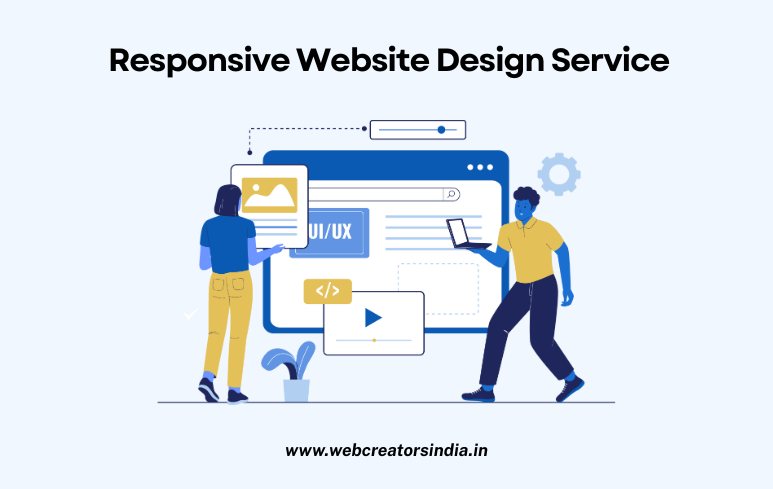
Automatically adjusts to fit any screen size, from desktops to phones.
Google prioritizes mobile-friendly websites in its search results.
A good mobile experience keeps visitors engaged longer.
One site works everywhere, avoiding separate mobile site development.
A seamless user experience on any device encourages action.
Update content once; it propagates correctly across all device layouts.
Adapts to new screen sizes and resolutions automatically.
Responsive pages display correctly when shared on social media.
Automate your order fulfilment process by integrating shipping agency
We design to attract, retain, and convert visitors into loyal customers.
Optimized websites ensuring superior performance, SEO benefits.
Focused on intuitive navigation and seamless interaction for every visitor.

Ensure Your Website Looks Perfect on All Devices From Desktop to Mobile - Seamless User Experience Optimized Layouts That Adapt to Every Screen Size